Orientations Look and Feel
Client: The University of British Columbia’s Okanagan campus, Orientation and Transition, Student Communications
Target Audience: New-to-UBC Students, returning UBC Okanagan students, and the campus community.
Design Deliverables: A look and feel for orientation and welcome events, digital assets, and wayfinding/navigational signage.
Design Criteria: Bold and creative, but polished. Colourful and eye-catching. Exciting design, but it’s important to be generic enough for multi-use.
Design Tools: Adobe Illustrator, Adobe InDesign, Canva, Microsoft PowerPoint, and Keynote.
Overview
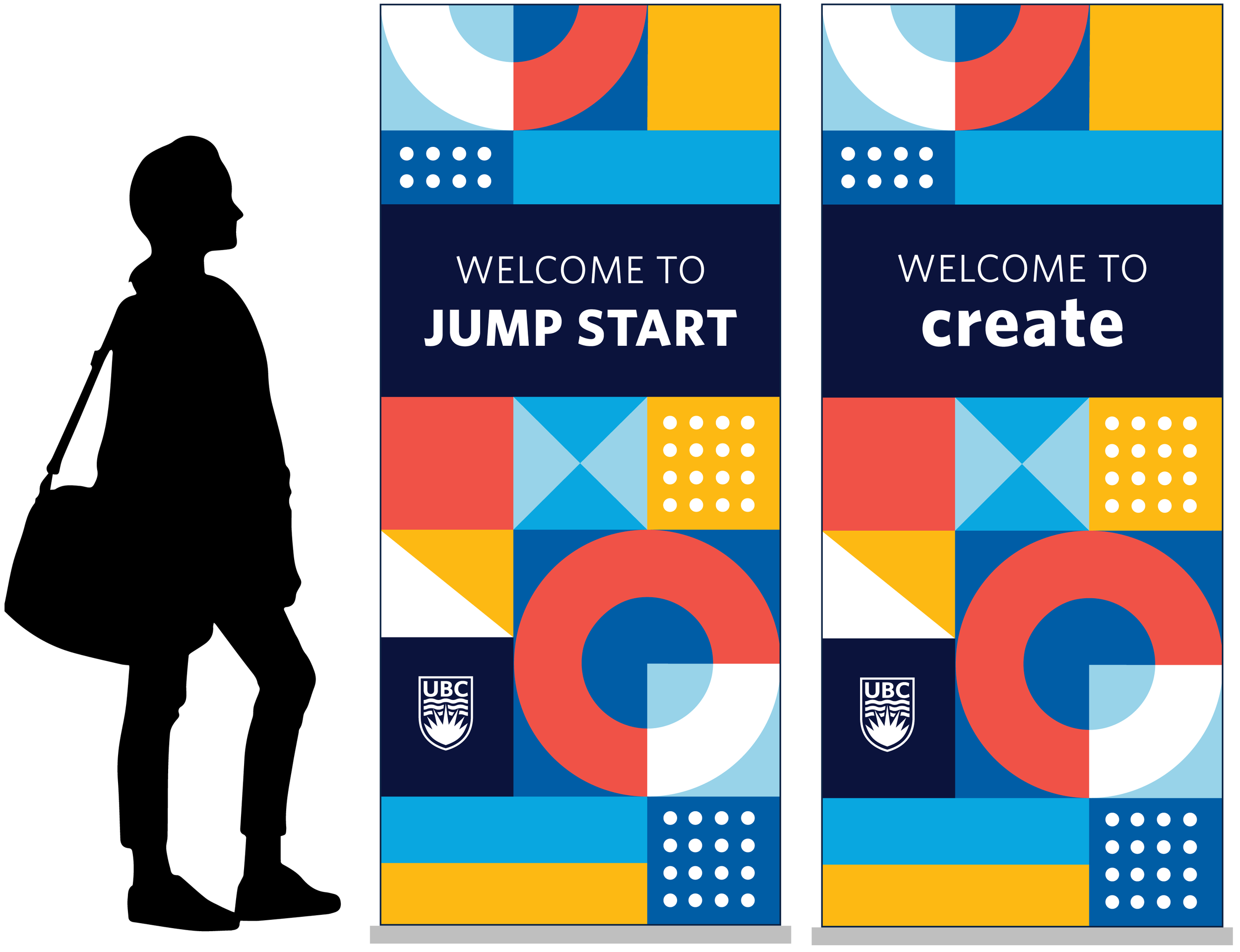
A distinct look and feel created for student orientation and welcome events at UBC Okanagan. There are two main initiatives that feature the look and feel:
Bold, creative, and colourful wayfinding and navigational signage with the main goal to attract students and direct them to event checkpoints.
Digital communications created to support Weeks of Welcome activities and encourage attendance.
Goals
Develop a look and feel for orientations and welcome events.
Create awareness and encourage attendance for Weeks of Welcome activities and student orientation events (Create and Jump Start).
Challenges
In most situations, the audience will be new-to-UBC students. These pieces are their first impression of UBC Okanagan.
All deliverables will be used to support the first full in-person student orientation since the pandemic.
Existing orientations materials are old and not consistent in look and feel.
Design a professional, polished look and feel—fun and eye catching. A design that can be formatted to work on physical signage, digital communications (social media assets, digital signage, presentation templates, etc.), print materials, and swag.
Concept Development
Step one: Design research to determine the most popular design trends in signage, digital, and print communications. Consider a selection of directions that would work well on different formats. Discovery: a pattern or specific theme is the most ideal for alignment across digital and print communications.
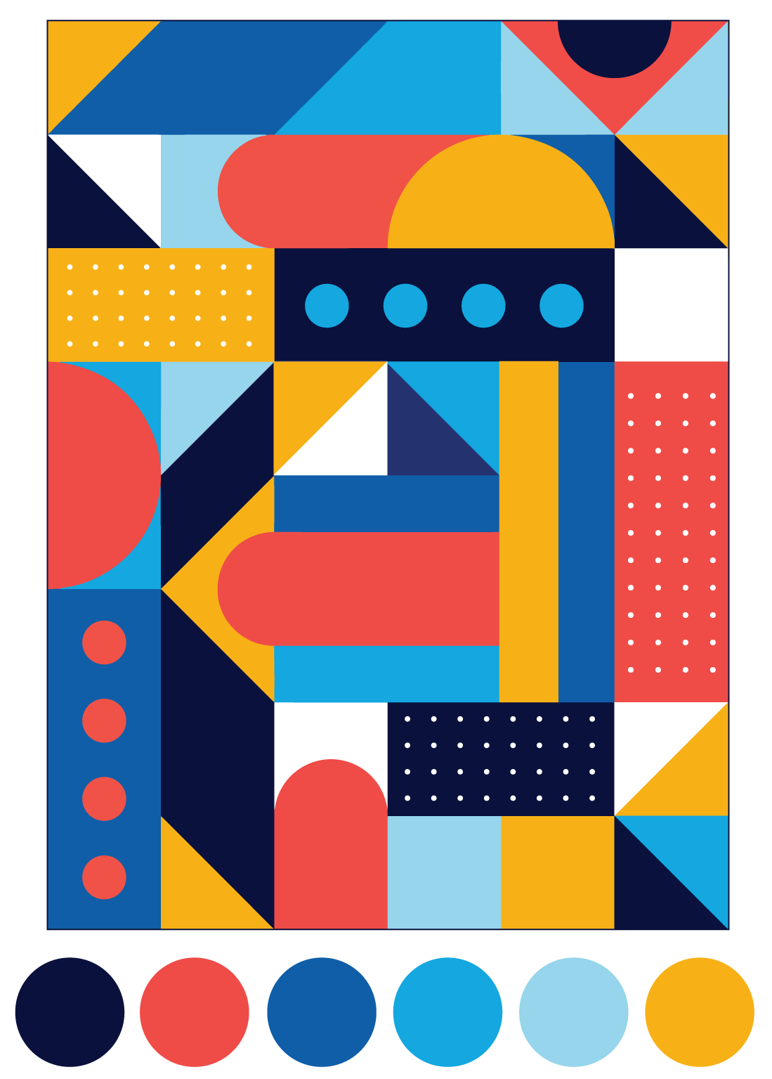
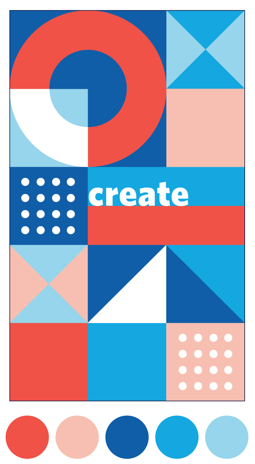
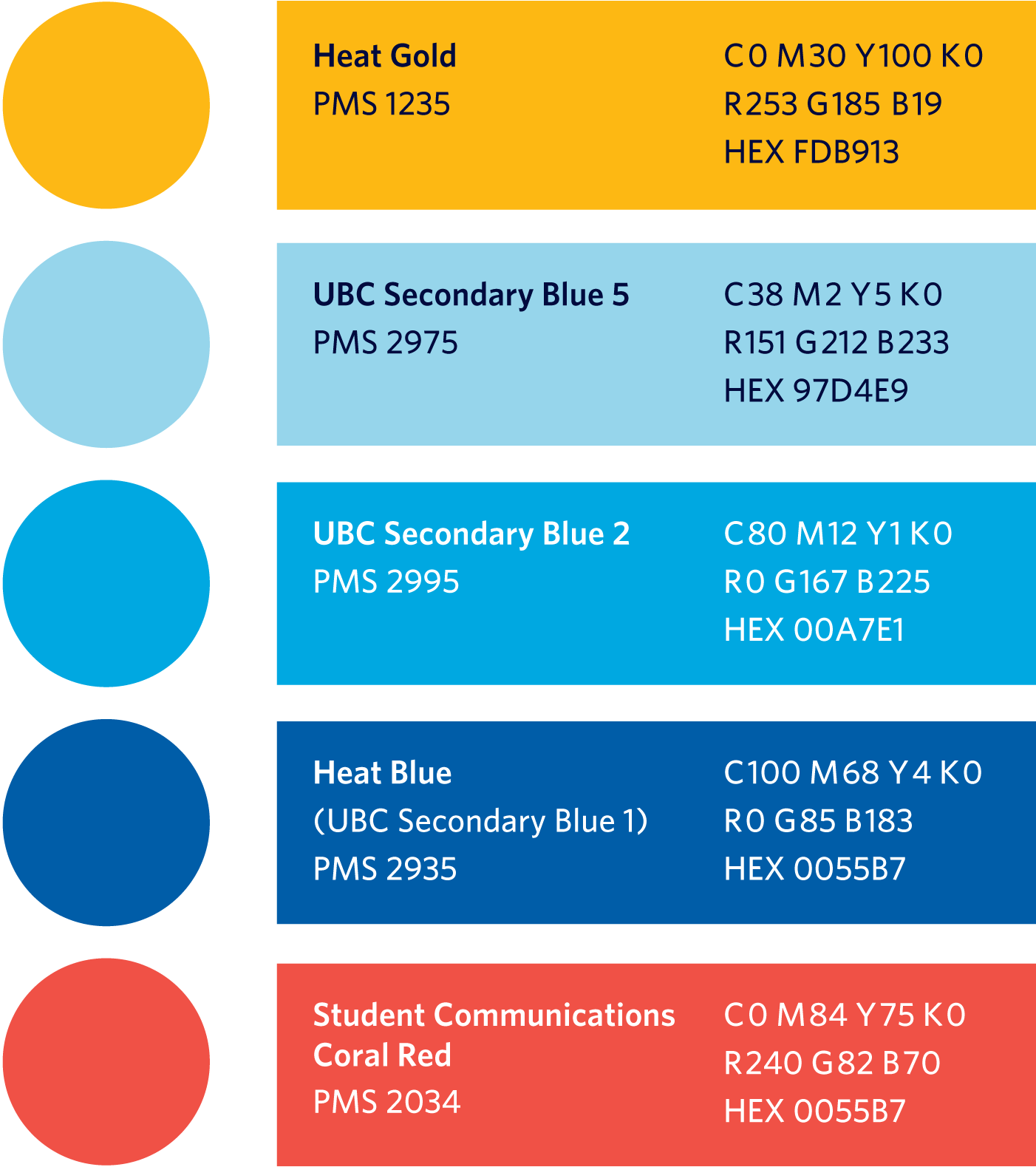
Step two: Create colour palette options, three distinct themes/directions (based on current design trends), and potential design concepts for client review (the full document).
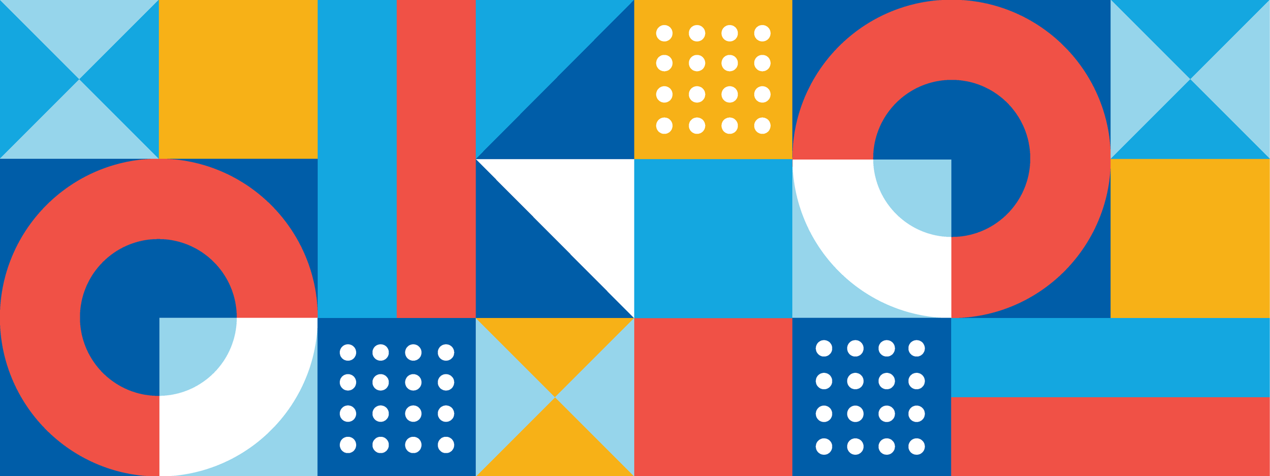
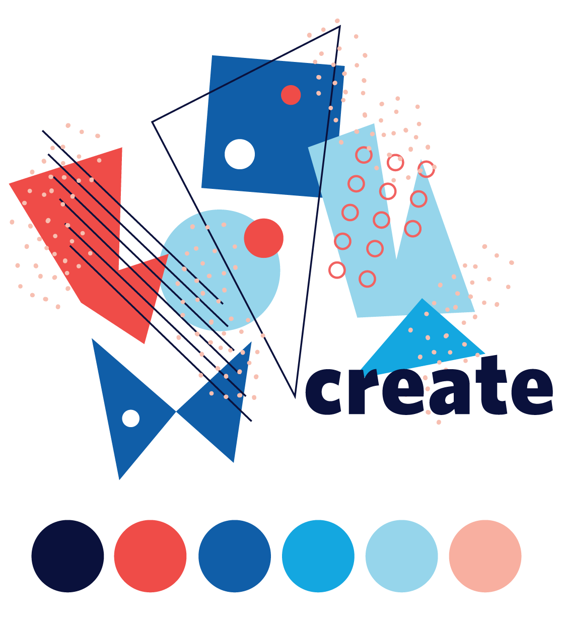
Concept option one: geometric
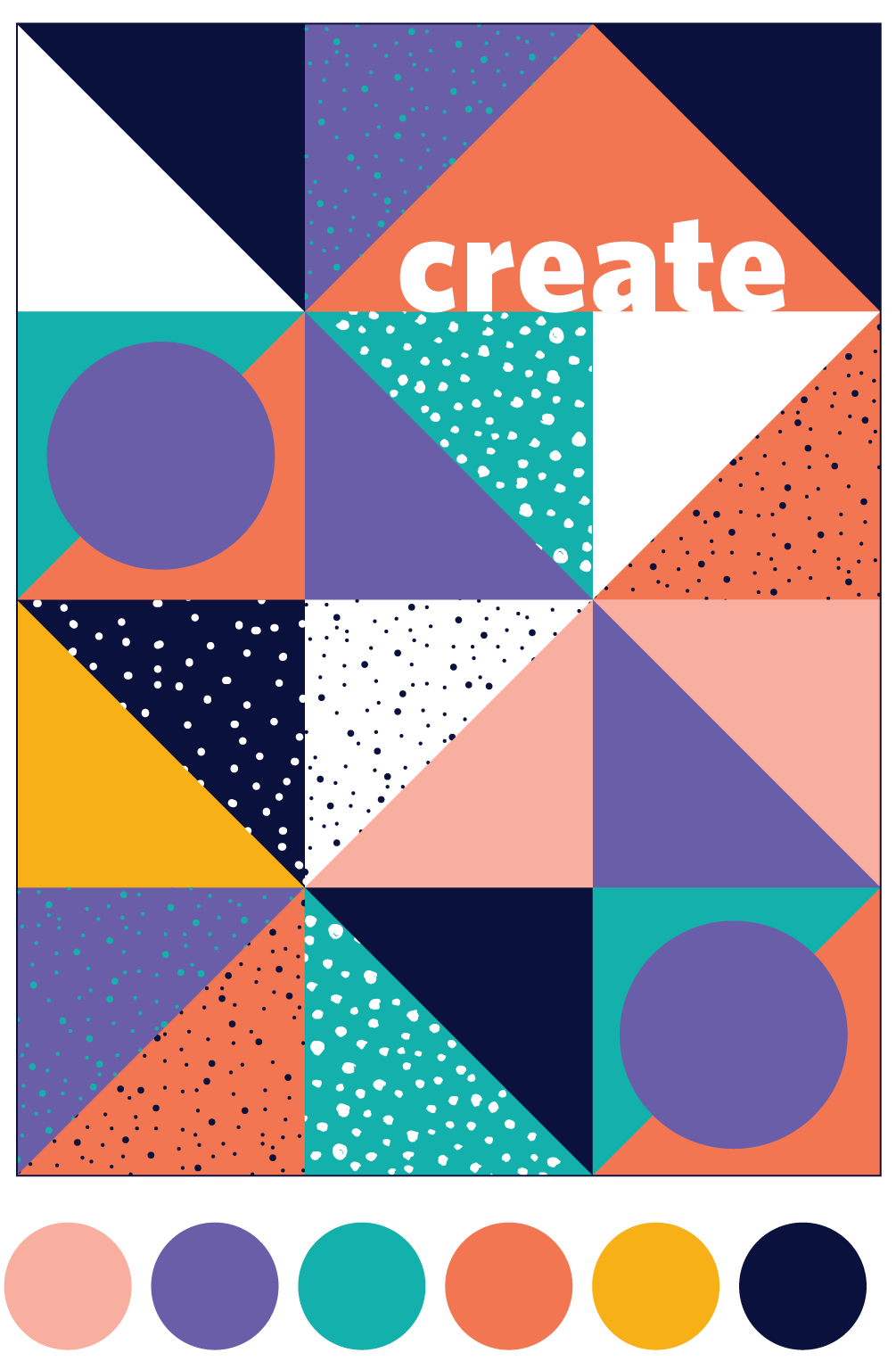
Concept option two: retro
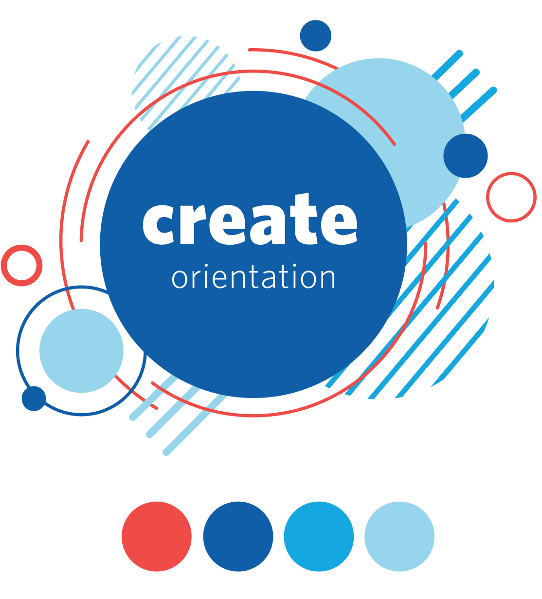
Step three: Design approval. The client selected a direction with minor adjustments to the colour palette.
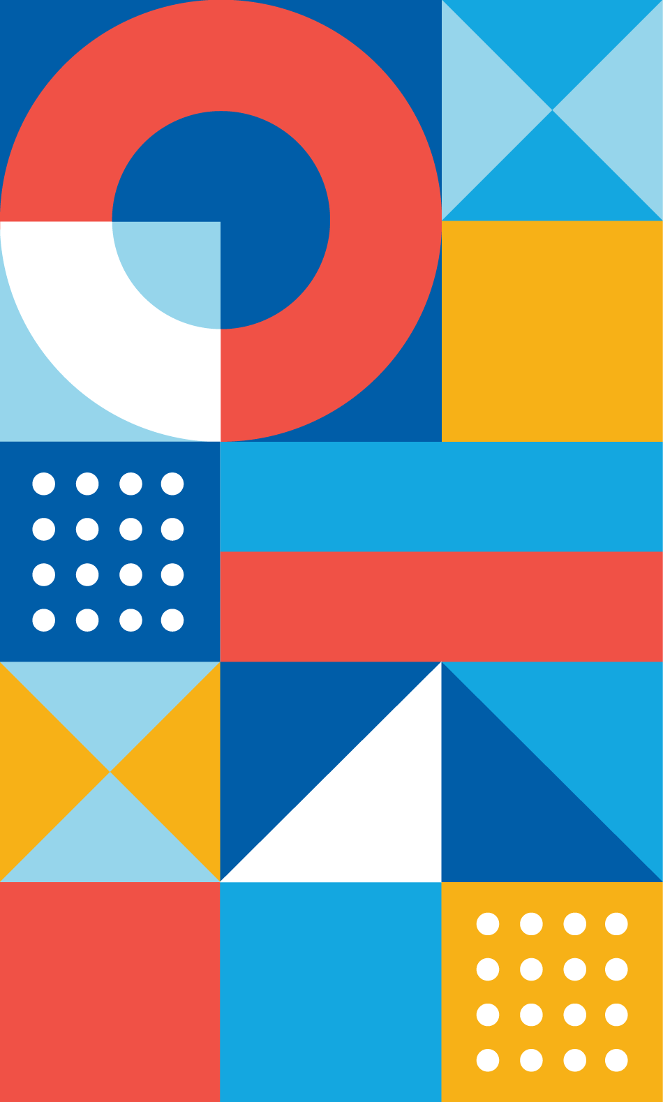
Step four: Design the final pattern and colour palette for student orientations and welcome event.
Final Execution
Phase one: Bold, creative, and colourful orientations wayfinding and navigational signage with the main goal to attract students and direct them to event checkpoints.


Phase two: Weeks of Welcome digital communications created to support activities and encourage attendance.